



Key takeaways
A price history chart is a factual record of what a store has actually charged — not a prediction, and not the same thing as a "was $X" badge.
- Read the shape first: steady, one-drop, yo-yo, or pre-sale spike — each says something different about whether now is unusual.
- Compare today to your own observed lowest and highest, not a stranger's claim about the "lowest price ever."
- Short watch history means soft conclusions. One data point is a starting line, not a verdict.
A price on a page is a number. A price history is a paper trail — and paper trails don’t lie, even when the retailer standing next to them is trying to.
With enough of a trail, you can spot a fake sale from across the room, see exactly where today lands against everything you’ve watched, and admit when you simply don’t have enough evidence yet to call anything a deal. That’s the whole trick. No forecasting required.
Charts below are worked examples in Pricemist’s style — illustrations, not one specific product.
What you’re looking at
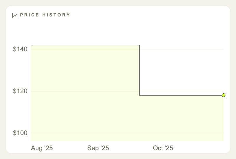
Time along the bottom, price up the side. Flat means the store didn’t touch it. A step means it did. Most real charts you’ll actually watch look like this one — a couple of levels, not a staircase.
Three rules before you read anything into a squiggle:
- Meaningful moves only. A quiet week isn’t neglect. It’s just “still $84.”
- Few levels is normal. High, then a low that sticks — that’s not a broken chart. That’s most charts.
- Thin history doesn’t get an opinion. One data point isn’t a verdict. It’s a starting line.
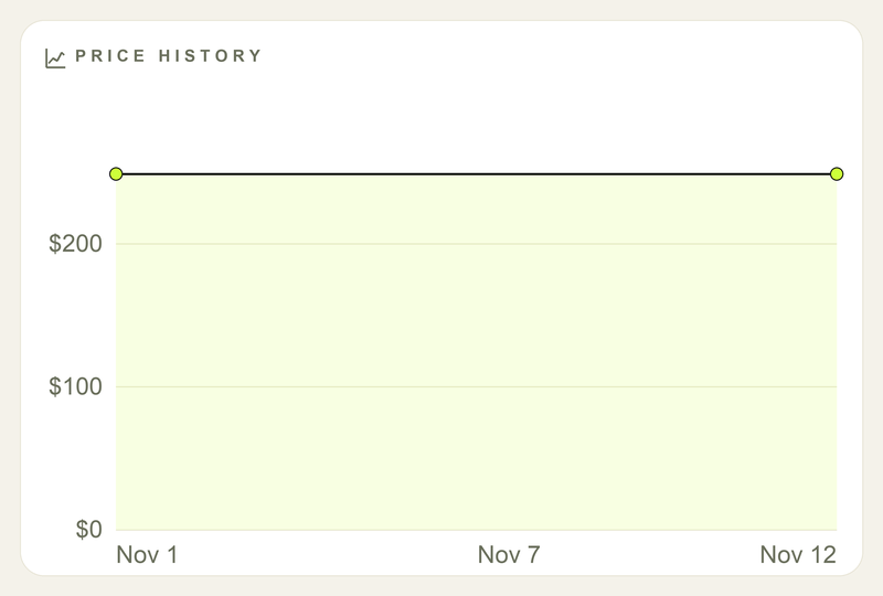
First price logged, nothing to compare it to yet. Don’t let anyone — including you — call this a bargain.
A drop alert is a fact: now $X, down Y%. It’s not a recommendation. Nobody’s handing you a buy stamp — that part’s still yours.
Four shapes worth knowing
Steady
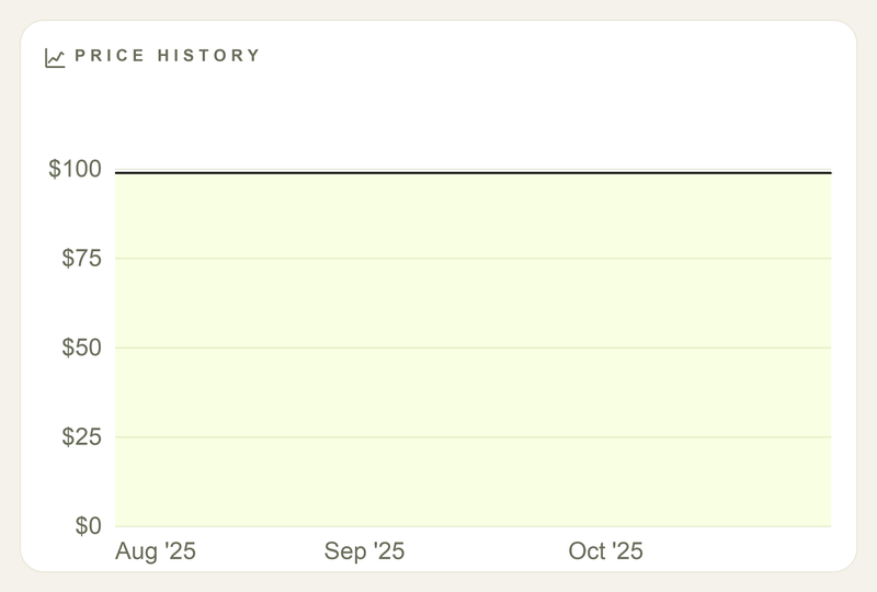
Flat for three months means exactly what it looks like: nothing happened. No secret markdown hiding behind the curtain, no fake urgency either. If the price already works for you, waiting for stability to break isn’t a strategy — it’s just waiting.
One drop — then stay
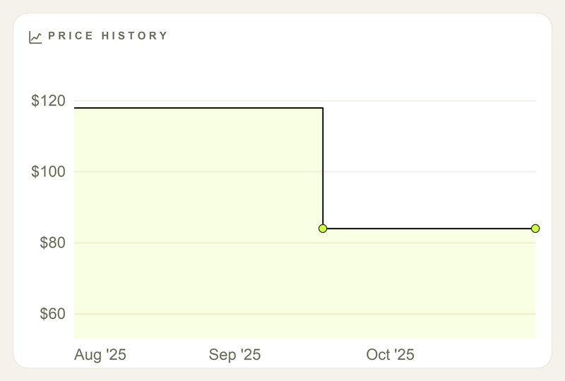
This is the move you’ll see most often: one high, one clean cut, then a long stay at the new floor. Compare today to the lowest you’ve actually observed, not the internet’s idea of an all-time low. Match that floor across a decent stretch of time and you’ve got a solid fact — not proof it can’t go lower, just proof this is the lowest it’s been on your watch.
Yo-yo
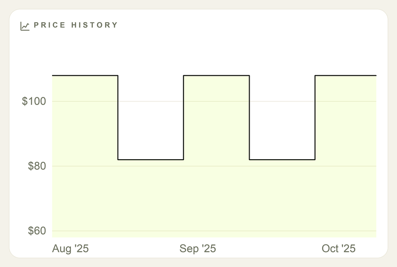
Cyclical prices exist — mostly in fashion and promo-heavy stores — but they’re rarer than every “just wait for the next sale” comment implies. Watched the swing happen once or twice already? Buy near the trough. Haven’t? You’re not reading a pattern, you’re guessing a rhythm. Most products never yo-yo. They just sit there.
Pre-sale spike
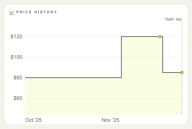
The oldest trick in retail: jack the price up right before “sale day,” then discount off the inflated number. Ignore the percentage — it’s doing math on a number that was never real. Compare the sale price to what it cost before the spike. Still higher than last month? Congratulations, you found the discount that wasn’t.
Numbers that matter (and ones that don’t)
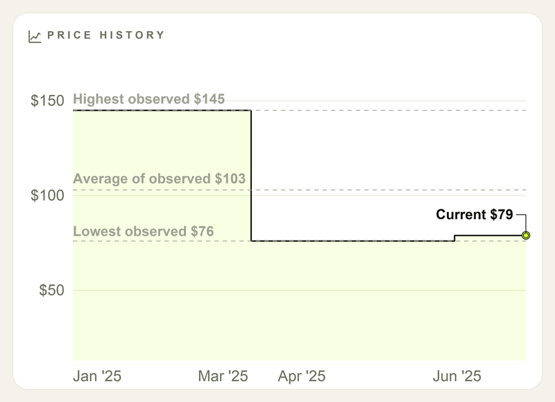
- Current — what you’d actually pay today.
- Lowest / highest observed — the edges of what you’ve watched, not “cheapest in human history.” A week of watching makes “lowest” a meaningless brag.
- Average — a rough center, weighted toward whichever level sat around longest. Good for sniffing out a “15% off” that isn’t.
- Span — how long you’ve been watching. Short span, soft conclusions. No shortcut around this one.
A retailer’s “was $X” badge isn’t a metric. It’s a pitch.
Two traps the chart catches fast
Phantom original
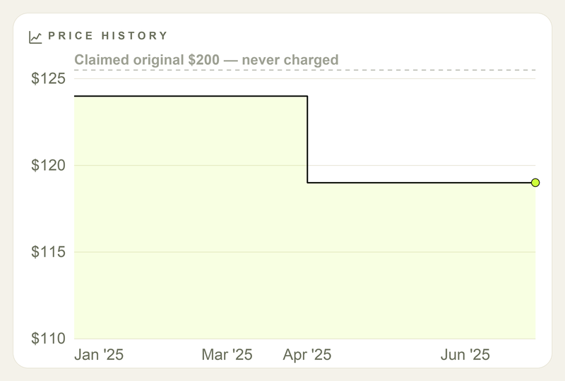
$200 crossed out, $120 in bold — except your chart shows this thing has never once sold above $130. That $200 was never a real price; it’s an MSRP somebody made up. Nobody in your history paid it, so the “discount” is fiction dressed as a deal.
The sale that never ends (and its holiday cousin)
If the “sale” price is just… the price, the badge is decoration. Some stores run “40% off” permanently, which makes 40% off the actual price and the crossed-out number theater.
The seasonal version is the same trick with a calendar attached: October at $80, a climb to $120 by late November, then a “Black Friday deal” at $85 — still $5 above where it started two months earlier.
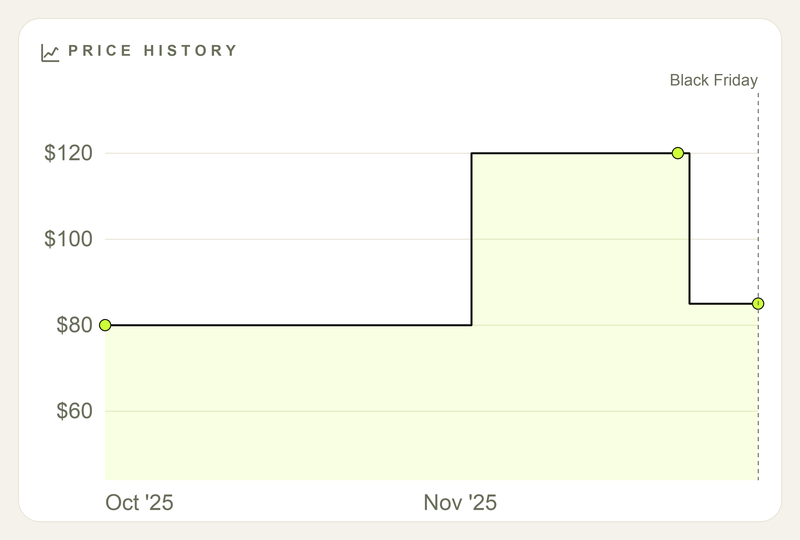
Start watching a month or two before big sale events, and the inflation shows up as a fact instead of a vague feeling that something’s off.
Before you buy (or wait)
- Check the chart — or start one if you haven’t.
- Current vs. lowest observed. How long have you actually been watching?
- Thin history = a starting point, not a deal call.
- At or near the lowest over a real stretch of time = a strong position. Still not an order to buy.
- Well above a past low = the “sale” might still be expensive by your own standard.
Alerts tell you something moved. The chart tells you where. The buying part’s still yours.
The whole job
A chart won’t tell you what to buy. It just won’t let a fake “was $200” pass as a fact anymore.
Read enough of them and the tricks get obvious fast: a crossed-out price that never existed, a “sale” that’s just Tuesday’s price with a sticker stapled on, a spike dressed up as a discount. None of that takes a forecast. It just takes looking.
Ready to put it into practice? See Smart Shopping 101: When to Buy and When to Wait — and browse things worth watching until they’re actually cheap. Pair with 5 Signs You’re Paying Full Price when the badge looks louder than the line.